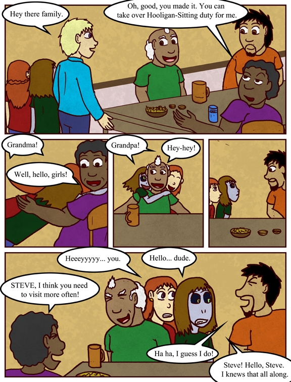
That Guy We Saw One Time Several Months Ago.
(Marta makes periodic solo-trips)
↓ Transcript
TODD: Hey there family.
MARI: Oh, good, you made it. You can take over Hooligan-Sitting duty for me.
SELKIE AND AMANDA: Grandma!
MARI: Well, hello, girls!
SELKIE AND AMANDA: Grandpa!
THEO: Hey-hey!
(AMANDA and SELKIE stare silently at STEVE as he grins expectantly.)
AMANDA: Heeeyyyyy... you.
SELKIE: Hello... dude.
MARI (Laughing): STEVE, I think you need to visit more often!
STEVE (Laughing): Ha ha, I guess I do!
SELKIE: Steve! Hello, Steve. I knews that all along.
Tried a new process on this strip. It took longer and yielded a final product that was indistinguishable from the old one anyway. ...Not all experiments are winners.


I would have gone with “Uncle Guy” myself.
Did they see him, and recognize him as the fiancé, but just not remember his name?
Or does he visit so seldom that they had no idea who he was? “Uhh, Hey Dude. Good to see you. (Who the hell is this?)”
I wouldn’t say indistinguishable Dave! I noticed it looked a bit different, and actually enjoyed it 🙂 but then we are our own worst critics
I enjoyed the notice too! It gives the page a warmer tone! I’ve seen a lot of artists embracing using colors other than black for the line work, and I really like the warm, indoorsy feeling. Like it feels like a scene change in a cartoon, moving from the well lit dress boutique to an indoor restaurant with different lighting. I’ve even see artists using either a specific color for each character’s outline or even outlining each part in a different color (i.e. a reheaded character’s hair was a a red-tone outline, but the purple shirt would be outlined in purple, etc etc…), but I know that’s time intensive! I say keep experimenting with the technique if you feel like trying it 🙂
Not all experiments are winners, but almost all are a datapoint that yields what can be useful information. I did not notice the line color. What I did notice was that the whole page seemed like they had home lighting that was too dim to be comfortable for me for playing board games, but OK for watching the big screen. The artwork was good, just not revelatory for me. And it was still good work. Keep up the science. Selkie needs the role models.
Definitely noticeably warmer. I like it but if it takes that much longer… well, your other pages are just fine too < 3
To be a little clearer, the colored outlines aren’t what took longer. Those I can incorporate into the old method easily if it works out better than standard Black.
I was trying to use a combination of a softer brush and lowered brush opacity to create gentler outlines, instead of my usual stark ones. The softer brush made coloring take longer due to having to touch back areas that didn’t get picked up on Selection, and having to make sure the aliasing didn’t create “gaps” between the color and the lines. The lowered brush opacity made things look messier as colors bled under it and mandated more manual clean-up, which didn’t look good at the end (lines were too soft) so I just undid it anyway.
It’s something I’d probably pick up speed at coloring with softer outlines as I did more of it, but I noticed after flattening everything down that the line softness just isn’t all that noticeable at the final resolution, so really out of the changes I tried working with while drawing this one, I’d say only the change in line color was a successful point.
nah it does have a softer look too, looking at it again.
what program do you use, if you don’t mind my asking? willing to bet there’s a shortcut of some sort o:
In any case it’s a nice look, i feel like it suits the vibe of the comic?
not sure how i feel about the yellow in the next page’s bubbles though, seems almost leaning toward Too warm