I hope everyone had a good weekend. 😀 I can’t believe it’s almost 2011! O_o Weren’t we supposed to have jetpacks, starships, and robot maids by now?
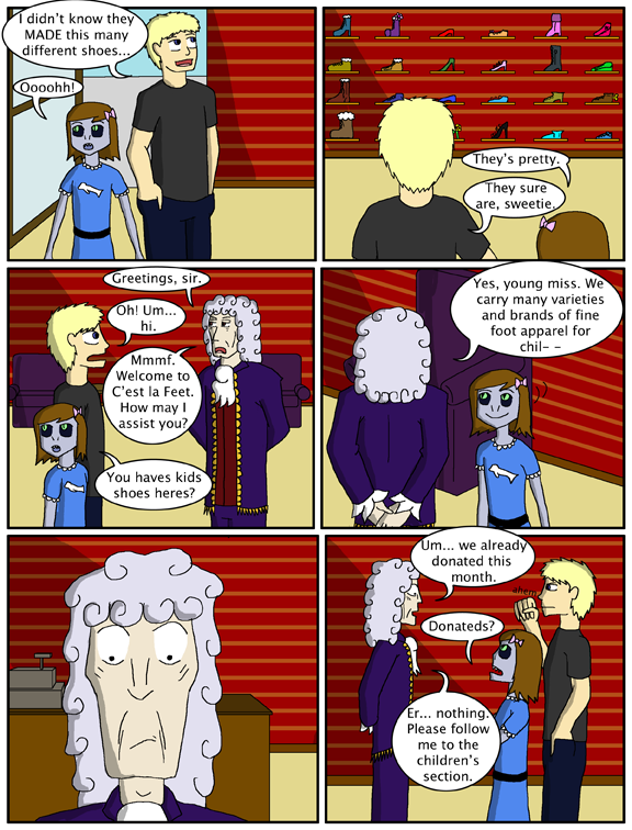
(FYI, the C’est la Feet attendant is named Gregori. He really should have the graces to introduce himself properly. -_-)
On a tangent, I have a forum post here discussing some thoughts on a change in comic format that I would love to hear some feedback on before I make any decisions.
Also! I have a Fan Art update to share with everyone! Fanta sent me this cute drawing over the weekend:
2.jpg)
Thank you very much Fanta!
Today's edition of the Secret Commentary is empty, because Dave failed to come up with something for it.


She is really cute in panel four.. (:
I agree with Dodger:)
In reference to the forum post, I like the possibility of more updates. 🙂 M/W/F would be pretty great, even.
I like the idea of more updates. Even if I dont check it in a while its always nice to have a couple to read
I agree with Dodger, as well. The fan art is cute, too. 🙂
Personally, I prefer the current method of comic presentation. I suggest the layout stays as it is.
I think the uniform would be funnier if they guy wearing it didn’t look like this was his normal attire. XD
And I swear Selkie is getting taller! o_O
Gregori knows what’s going on here.
Prefer the current style. Even if I could have more Selkie per week, this format is better for story telling, and I read it for the story. I vote for keeping this layout.
I’d rather have more Selkie fewer times a week, so we get more “bursts” of plot, rather than smaller chunks more frequently.
Thanks for caring about your readers’ input!
Oh, something I must ask…is Gregori’s hair ACTUALLY like that, or is it just a wig? With that kind of folk, you can never tell for sure.
Just remembered she was wearing the bear slippers lol
For the record, I utterly loathe the phrase “sweet sassy molassy”.
Uh ohs!…What an interesting looking Colonial fella. And I agree with everyone, selkie is A-Dorable in pannel 4. So is the fanart. Hope you all had a great holiday!
I’m in enough forums as it is, so I’m not going to sign up just to post about it. IMO, 4 panel format is great for comedy, while full-page spreads are best for story and character development. I say switch off when you need to if you want to change.
The way this is drawn, it looks like Todd’s holding up a fist to quiet the guy rather than to cover his mouth, lol.
I don’t get it…
@Velociraptor, that’s the impression I had too 😉 Either way, Gregori gets points for recovering quickly.
As for the change in format… hard to say, really. In all honesty, I’d have to see a couple of weeks of the new one before passing judgment. What it really comes down to is what the artist feels comfortable with.
Donated what? Shoes?
Hey, just stumbled upon this comic today (from Blip) and i read it all 😀 i absolutely love Selkie! and i feel the strong urge to draw some fan art…
Heh … looks like Papa Bear’s about ready to bare the claws in that last panel. That clerk may have to do some major sucking up to make this sale …
I have to agree with the majority here – I prefer the current format. Don’t worry about it meaning less frequent updates.
“(FYI, the C’est la Feet attendant is named Gregori. He really should have the graces to introduce himself properly. -_-)”
I don’t know … I think he’s too snooty & high falutin’ to introduce himself! If you don’t know who he is already, he figures you don’t need to know.
Re: “I can’t believe it’s almost 2011! O_o Weren’t we supposed to have jetpacks, starships, and robot maids by now?”
We were supposed to have those decades ago! Check this out: http://www.youtube.com/watch?v=mXHWDhk7Hok
Panle four: LOVE FOREVER
@Dave Love this comic! I’ve read it through like 5 times, lol. I actually just managed to get ack here after a looong break from the internet due to my computerbing stupid. Looking back at these now, I can really see how much your style has developed! I’m actually kind of jealous… I can’t draw any face shate too different from the typical moe-anime shape without it looking horrid. But, umm… Don’t take this the wrong way but… Just a little tip for shading that honestly took me a long, long, LONG time to figure out: Remember that nothing is flat. Sounds simple, but is oh so difficult. >.<
*computer being
*face shape
Stupid bad spelling….
That guy looks like he thinks she’s a mobster
“This is a very nice shoe store you got here… be a shame if something happened to it”