What?
↓ Transcript
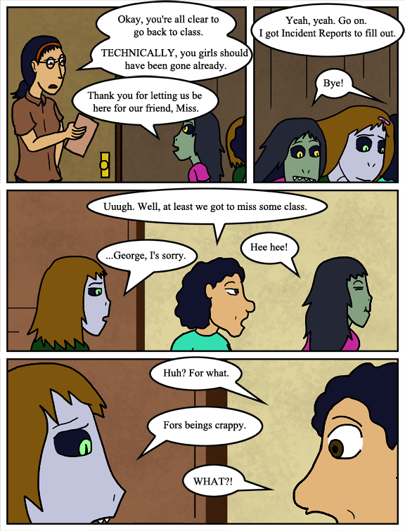
Lisa: Okay, you're all clear to go back to class. TECHNICALLY, you girls should have been gone already.
Te Fahn: Thank you for letting us be here for our friend, Miss.
Lisa: Yeah, yeah. Go on. I got Incident Reports to fill out.
Selkie, George, Te Fahn: Bye!
George: Uuugh. Well, at least we got to miss some class.
Te Fahn: Hee hee!
Selkie: ...George, I's sorry.
George: Huh? For what.
Selkie: Fors beings crappy.
George: WHAT?!
Been tinkering with new texture brushes on recent comic's backgrounds, but at 5-10% opacity Im not sure how impactful they are.


Nurse Practitioner: OOooowww, look at this! A guilty conscience! I haven’t seen one, in a child since, … uh, hhhmmm, I can’t remember the last time….
I like the new backgrounds. Give them more… depthyness.
And I am a college educated artist. That’s a technical term.
Hey, Georgie! Compassion is a two-way street (or rather a circle, with no beginning and never ending).
I dig the backgrounds a lot.
I’d really like to encourage you to try incorporating shadows if you’re up for it.
I used to do shadows. I stopped doing them because I felt like sometimes they made things look a bit more heavily-lit than I liked. Can’t deny I have been wondering if I should revisit them, though.
I’ve been studying over Gunnerkrigg Court’s artwork, as an example of comic art that (mostly) doesn’t use shadows, or at least doesn’t use cel-shading style shadows as I was. Tom Siddell uses texturing and linework for the majority of his character art, but doesn’t often use actual shadows unless the particular scene calls for it. It’s something I’m looking to take some pointers from.
What if you did the shadows at a very low opacity too? (probably on a separate layer, so you can just do them in black, blur them some, then turn the layer down for a consistent tone)
That’s funny, because I think of Gunnerkrigg court as a comic with a lot of very pronounced shadows (and one very special Shadow).
Tom usually does shadows around necks and such, and he also does a fair amount of highlights and dark creases in clothes (Check out the chapter 73, “Goosebone”.) Often, even when the characters are unshaded, the background has a lot of detail and shadows. Very flat scenes tend to be next to etheric scenes, which are often drawn like they’re lit by candlelit (E.g. Ch 11 “Dobranoc, Gamma.” Contrast the unshaded characters in the library vs. Zimmy’s imagination.)
(I like the backgrounds, too. Subtle texture!)