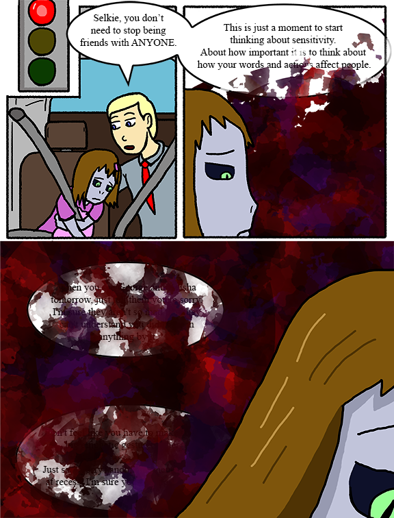
Taking advantage of the transcript for this one.
↓ Transcript
Todd: Selkie, you don’t need to stop being friends with ANYONE.
Todd: This is just a moment to start thinking about sensitivity. About how important it is to think about how your words and actions affect people.
Todd: When you see George and Keisha tomorrow, just tell them you're sorry. I'm sure they aren't so mad that they can't understand you didn't mean anything by it.
Todd: Don't feel like you have to make some big emphatic gesture, either. Just say "sorry" and invite them to play at recess. I'm sure you can work it out.
(Author's note) The text in this comic becomes increasingly obscured as Selkie's background "emotional spatter" overtakes the words being said. The transcript reflects words that may be obscured or even erased by Dave's artistic snobbery.
The stoplight is just there so nobody thinks Todd is leaning over to talk to Selkie mid-drive.


This is just beautifully done. Bravo, Dave.
This was a wonderful way of visually representing that feeling. I know that feeling all too well.
One thought, Dave: in the transcript, maybe move the author’s note above the “When you see George…” block, indicating that it’s at this point that the words become illegibly obscured?
I think it could only be consider artistic ‘snobbery’ if the obscured text HADN’T been included in the transcript. As it stands, I’d say including it makes you a gracious artist, Dave, since it lets those of us who were really curious about what Todd had to say have access to the entirety of his advice.
This is a perfect way to visualize that shame/guilt spiral!
I like the idea but the red effect should be a little more transparent so we can see the text in a printed/PDF version sans the transcript later.
Back in the day,… there was a comic called “SSDD,” and in it they had a bunch of scenes showing how overwhelming trauma presented itself to a variety of characters. Having one’s image in the morning mirror turn to black and white TV-static or have a character’s reflection blink out to suddenly look like a different character. Another comic also has an animated .gif, that has the text come drifting down in segments like snow flakes to obscure the image of the character.
Personally I really was surprised, pleased, and Wowwed by those effects, but while it added to the punch of the story, IMAO – it was the action in a comic of stills that was the Wow factor.
Here, Dave has shown clearly and with a punch to my guts, what trauma, pain, and loss of self confidence look like, without hours of work making dramatic fluff. And it still has the Wow factor of a punch in the stomach. Ahh my friends, and ohhh my foes, this is: Art, with a capital A **
** Sorry, Ms. Parker, I couldn’t resist.
Right in the feels! 🙁
This is a powerful strip, love it.
I’ve had to work for this not to be my constant
Artistic snobbery my rear! I was curious about the words and appreciate them in the transcript. The art style really captures the input fading aspect of overwhelm.
I love your portrayal of Selkie in the first panel. She looks so young and vulnerable, not her usual audacious self.