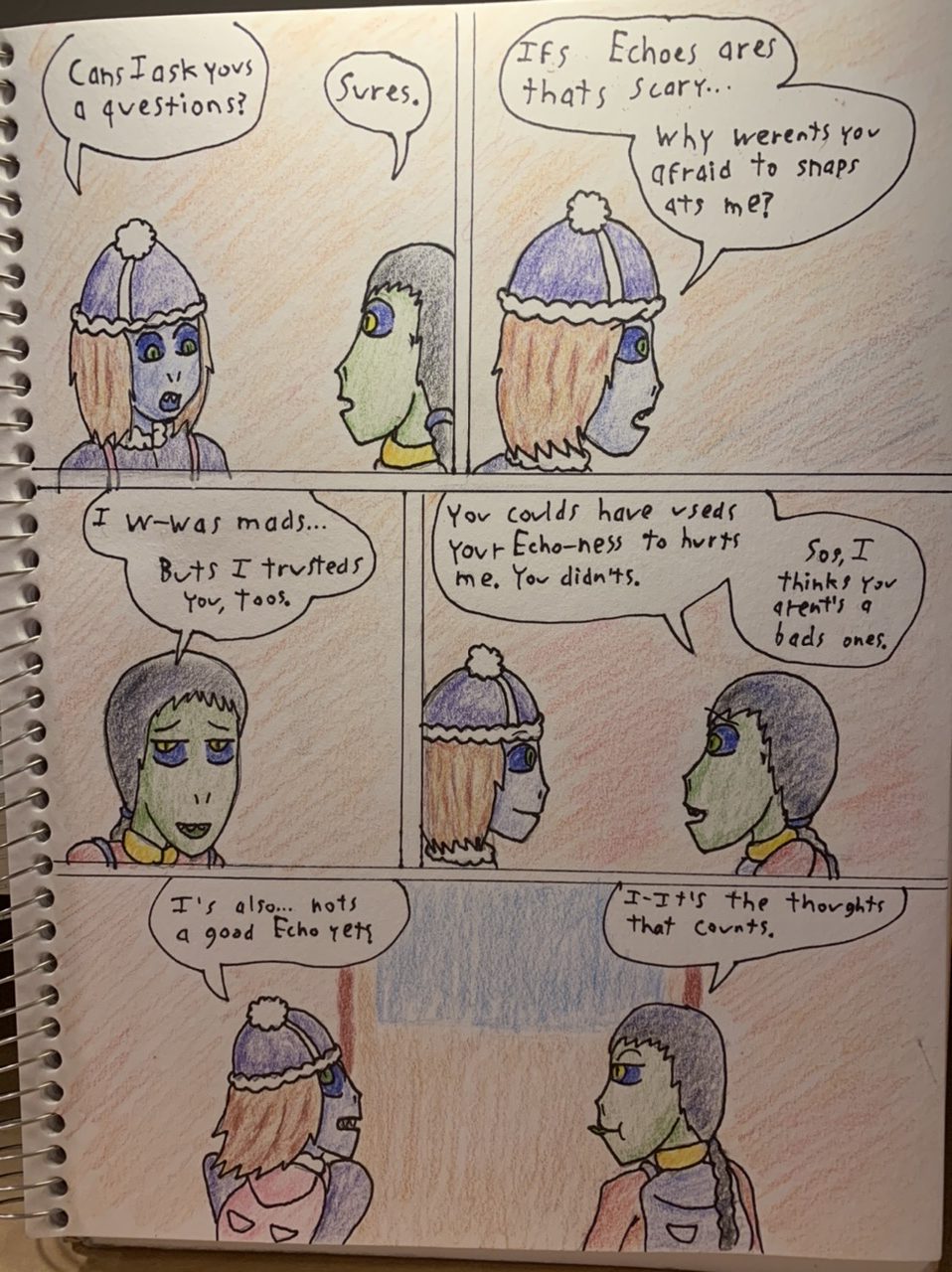
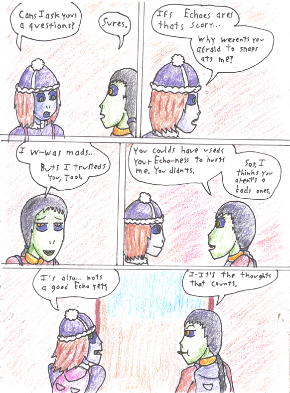
Today’s comic is hand inked and colored with colored pencil, because I found myself out of town without a laptop. Just fyi
-EDIT- I scanned the colored pencils in to make a cleaner image, and I think it lost something in the translation. Original iPhone photo version for comparison:
-EDIT2- I’ve swapped the camera-photo version back to the main one because frankly, this drawing did not scan well at all. Something to mess with later maybe. Scanned version below.
Today's edition of the Secret Commentary is empty, because Dave failed to come up with something for it.


We’ll take it!
I like this!!!!
Yeah, this is a cool style! I would like to see more in this vein, now and then or maybe for short stretches or for effect (comedy, flashbacks, etc.). It’s neat to change it up now and then.
(Speaking of which, Creepyfest 2019 has begun. My fics have turned to the spooky once again ^.^)
Agreed! This is a nice change-up. 🙂
Ditto! Panel 3 is my favorite.
Yeah, it looks quite nice!
Love it! I’m liking Te Fahn’s character more and more.
Can I just say, I appreciate the fact that your handwriting looks like my own!
You poor pitiable soul
Your u’s are weird, but the rest is pretty legible. Gotta work on that consistent height and width thing (guidelines do help, and there’s actually a little tool that lets you easily draw lines of the correct width… a quick look says the Alvin Ames Lettering Guide, pretty cheap).
Though of course it also reminds me of a certain Peanuts comic strip, apparently from November 4th, 1961: “MY problem is usually margins” (link in my name there).
This looks really nice Dave!
Also I really love Te Fahn so much. Shes mu h braver and sassier than expected!
For those who use paper for their comic, Ames Lettering guide is a fantastic aid, and for $2.00USD, a real bargain.
Now to the meatier, heavier, more solemn topics:
All in favor of changing the name of the comic to “Adventures of Te’ Fahn” please cast your vote now.
That comic is very, very relatable.
Cue “Poor Unfortunate Soul” from Little Mermaid.
Might want to reword the last couple panels a bit, so that we’re not confusing “good” as in ethical with “good” as in skilled.
Just a suggestion.
Yet, this makes sense for a 3rd grade conversation..
Unclear writing like this would be forgivable from 3rd graders, yes. However, neither Dave nor I should thing, the vast majority of his readers are actually 3rd graders. Claiming that it’s “for authenticity” is just spin-doctoring.
It’s meant to be a wordplay pun, actually. Between the two differing uses of the word “good”. But as the adage goes, if I have to explain the joke, it didn’t stick.
I got the dual meaning, just not on my first read. But the good/skilled vs. bad/untrained, and good/ethical vs. bad/evil, adding up to “I’m skilled and possibly evil” vs. “I’m ethical and possibly untrained” seems to be interesting enough to leave it as-is.
Y’know, it’s Inktober.. so why not stick with the theme?
I’d be fine with the comic being in this handdrawn format going forward if it’s easier on Dave.
LOVE both facial expressions in the last panel.
I had a favorite comic that slowly updated, it was very pretty, very skilfully drawn, and dealt with themes that I wrestle with on a daily basis, (although not as severely.). The whole comic server seems to have vanished. Anybody know where it went? It was: What we remember”. It was a very good comic. I miss it
Was it this one: http://whatwerememberthemost.smackjeeves.com/comics/2326043/page-1/
Awesome drawing work there! I love it!
I mean, “What we remember most” is on Smackjeeves, but only the first 160 pages. Anyone know what happened to the dot com site?
oops, i should’ve read the REST of the comments before googling it…
te fahn’s stock is rising massively! i like that she started out so shy but now that she’s more used to her surroundings she’s totally different. she’s cheeky, sassy and seems very (emotionally) intelligent.
Very cool style today. And Te Fahn is shaping up to be the kind of friend Selkie may not have wanted, but did need.
Yeah, the original is better than the scanned version. The original was a very nice surprise, but the scanned version is kind of disappointing. Maybe next time, just crop the binding off, if you feel you need to clean it up (I like seeing the edges of the sketchbook, personally).
I agree, I definitely liked it better when we could see what it was IRL. And I’m more forgiving of oddities when it’s clear it wasn’t easy to do better, given the medium.
If you want a really good picture of your art. Take it outside or in sunlight. I figured that out with a lot of trial and error. Scanners just bleach out your art unless you use a lot of color. I’m talking about really rich colors. Pretty much no white showing anywhere. Also I really love your comic! It’s one of my favorites!