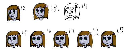
Third round of test heads. 12-14 were made using a more textured paint-y brush instead of the smooth standard brush at the current pixel size I use now (10pt). Not enough detail at this size to really tell, I don’t think.
15-19 are copy-pasted using the current line style but with different shading techniques. Some are smoothed/blurred out, some have a little more shaping, some are darker and some are lighter than the current shading.
I think, looking at these, I’d like to do a set where I try to break down character design a bit. We’ll see.
Today's edition of the Secret Commentary is empty, because Dave failed to come up with something for it.


Honestly, they all look the same. Just Go for as much detail as the time you spend on the comic lets you.
^ This. And trust your artistic vision. You are Selkie’s *artist*, Dave. You don’t need your audience to give you art advice. 😉
Thanks for the vote of confidence. I mostly just like sharing background development stuff sometimes (sort of like behind-the-scenes commentary), but I’m also curious about outside opinions since I have multiple angles I am considering. 🙂 In the end I’ll go the route I feel is best, but I harbor a curiosity of what others think along the way.
I am a long time reader of your web comic, but the last one has finally made me very curious. You’ve called Selkie’s language Tensei. It seems to be a bit of a pun as tensei, when written 天声, translates directly towards Heavenly Voice. Was this intended, or just a coincidence? (´∀`)
I should probably just go on letting you think I’m clever, but it is just a coincidence. I make up the words of tensei, including it’s title, by speaking nonsense to myself until I like the sound of what I hear.
I like the shading in 18 and 19 best. 17is a good mix between 18 and 19 but for some reason I don’t like as much.
On 16 it’s too harsh, I feel. And on 15, it’s too light.
I really like 15! :3 Runner up is 18!
I mostly though really like this comic! I’m excited for your next update.
I like 19 😀
I like the way the colors look on 15, especially with the highlights, but I also like the softness of 18.
I like the idea of the highlights on 15, and there might be some potential there, but the shine is too close to Selkie’s skin color.
The shadows on 19 seem way too “thick” by which i probably mean very dark with no transition. It just doesn’t look quite natural to have such a stark light/shadow contrast.
17 is kinda nice but it still seems to be having issues with the shadow-boundaries.
18 has a certain subtlety that appeals to me. I’m liking 18 the best, and it wins out over 10 as well.
I can’t really comment on 14 unless I see it in color. I much prefer 12 over 13, because 13 is too blurry for my tastes.
As for shading I like 15 best and 18 second best. The shading is too strong in 17 and a bit distracting from the artwork. 16 just looks like it has stronger lines, which makes Selkie’s face look a little too sharp and angular in my opinion, so I like 19 more than 16 if you opt for less shading.
14, 15, 18, 19, and 12’s okay. 🙂
i like 15 and 17 🙂
at this point im so enamored by the story that no matter what tthe art looks like I’ll continue reading
Your ability to draw numbers of a consistent size and shape is improving!
😉