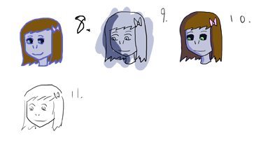
Sorry this Head Test is smaller than the last batch. I didn’t have as much extra time as I anticipated due to some last-minute stuff. I think I’ve decided on the thin lines for when this arc is over, mostly because I’ve been looking at some anime-influenced artwork I really like and I think going back to the thinner lines I used to use ages ago will open up more detail options than the thick lines going on now can really allow. I like how expressive and definitive the thick lines are, but sometimes they muck up opportunities for finer detail. And I, as a preference, do not care much for the “super thick outline surrounding an entire character” look, so I think it’s one or the other for me.
Also looking into changing how I do shadows, too. Right now my shadows are pure black on a 30% opacity layer (50% for night time or heavy shadow). Looking at a dark violet or indigo for shadows instead.


Though it’s not colored in, I like #11 of the ones on this page the best. It’s the way the lines don’t always meet that makes it better. Open linework when used right gives a kind of variable softness and depth to features, and does a better job of implying the ends of hair than solid, fully enclosing lines IMO.
#8 doesn’t work for me at all – the colour used blends into her skin colour, and doesn’t fit on the hair very well.
#9 looks like what memories or thoughts might be – mostly monochrome type of thing.
#10 looks very much like the thinner line ones in the last patch, can’t see much difference.
#11 looks like just a sketch to me. I like the expression, though.
If you’re going to change shadow colour, I think you might look into having special shade colours for a few things – like a darker shade of brown for her hair. The black shading worked rather uniformly, because essentially black is the absence of life, which is what shadows are too. When you add a colour component to the shadow, it inevitably will change the colour underneath. Of course you could test it out, see how well it works with colours like the other kids’ skin, or Amanda’s red hair. Maybe do colour tests on a “sketch Saturday”? 🙂
Number 10 uses the indigo shadows. I was afraid it wasn’t distinct enough of a difference.
Regardless of what you decide on the shadow colors, #10 is a lot cleaner looking than the other thin-line designs and I like it the best. Not sure I can help any more than the others on the shadow-colors though.
I, personally, am a fan of subtle changes over uberly drastic ones. I think ten looks great.
I noticed the shadow colour difference in #10, I just forgot to comment on it, sorry. And it’s one thing for it to work with Selkie’s dark brown hair and blu- sorry, periwinkle skin colour, but seeing larger patches of, say, Todd’s skin and hair shaded with that, might give a better idea of how well they work with different colours.
Another thought for shadows you could try is actually highlights. by adding highlights, shadows can look darker or more natural. Highlights can actually be different colors too, depending on the light in the scene
My personal preference for shadows is individual colors per color being shaded, like a different dark for skin or hair. It takes more time, but to me seems to add a professional touch. Maybe you could give it a shot for another sketch test 🙂
**Like button**
I personally think all the thin line styles look more or less the same. Maybe if you tried different types of styles for your sketches versus just the same thin lines over and over again it’d be more of a drastic impact.
It occurs to me that there’s only so much difference I can make with line width alone without fundamentally changing how I actually DRAW the characters. Detailing, hatching, etc.
Meant no offense, just trying to give some creative feedback. I’m sorry if I upset you, but my point stands that all the sketches look too similar to one another and I still believe you should try out different styles or techniques.
I took no offense at all, sorry if I gave that impression. 🙂 Was just looking over the iterations and realizing varying line width isn’t enough by itself.
Yeah, of this lot, 10 is easily the winner.
In comparison to 5, it’s clearly different on the hair, not so much on her skin – since it’s a similar shade. But without knowing the difference, and not having the comparison, it’s hard to see that. I thought it was 5, there again for comparison.
But yeah, subtlety can add a lot, without us realising. It’s what’s fun about pictures. If it’s about the same time, then I’d recommend going with 10, or as suggested, doing different colours based on whats’ being shaded. Though I imagine that could take it up a bit, having to know which colour to use. (Admittedly that’s a job you do once, then note it down for next time.)
10 & 11. Would say more details, but cat is licking my fingers. I guess i has a flavr.
10 preferred, then 11. Both give shadows, 11 more subtly than 10. Both 8 and 9 seem to lack shadow effect. (The blotch effect of 9 does give a partial shadow effect, but only for half the image, and so comes across as flat and confusing.)
I just like seeing your creative process:)